(Comment: this post was originally written in May 2016 when the author was leading the image optimization project at Netflix)
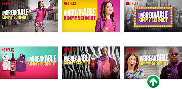
At Netflix, we figured out that optimizing which images to show users when suggesting videos makes a big difference. For example in the image above we see 6 images describing the new Netflix original “The Unbreakable Kimmy Schmidt”. The image at the bottom right attracts more users than the default image at the top left. Using machine learning to learn what images users are more attracted to is now a big effort that significantly increases engagement. This is a broad new initiative at Netflix that includes multiple teams (including myself).
In retrospect, it is not very surprising: users scan the page of videos and look for something appealing. The human brain processes images more efficiently than text, and a visually appealing image can grab the attention effectively.
More details on this effort are available in a non-technical blog post, and a technical blog post where more examples are shown. The non-technical blog post discusses issues like what are the characteristics of appealing images—more or less human subjects (less)? Heroes vs. villains (villains)? Is there a difference in preferences based on regions (yes)? These are all questions that are fascinating in their own right from a psychological perspective and making progress there could be a major scientific discovery.
The technical blog post linked above discusses the systems that power the new feature and the AB testing that was used to develop it.
Below are a few additional examples.
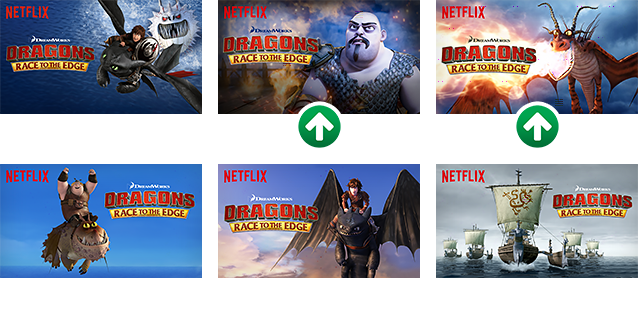
In the image above we see an anecdotal example where “nice guys finish last” i.e., exposure to villains leads to higher engagement than exposure to heroes.
.png)
In the image above we see how the best performing image (in terms of attracting user engagement) differs across different countries.
More information is available in the following presentation that I gave at MLConf 2016 in San Francisco.